THE LOTTERY
Editorial reinterpretation
on Shirley Jackson
| Topic | Guidance | |
|---|---|---|
EDITORIAL |
MARK BOHLE |
2023
This 6-page editorial design, accompanied by a cover, offers a new perspective on Shirley Jackson’s iconic short story The Lottery. Set in a small New England village, the story revolves around an annual ritual in which townspeople draw slips of paper from a box, with the unfortunate “winner” marked by a dot. The design highlights two key elements of the story: the alphabetical list of neighbors’ names who participate, and the symbolic dot that determines the fateful outcome.
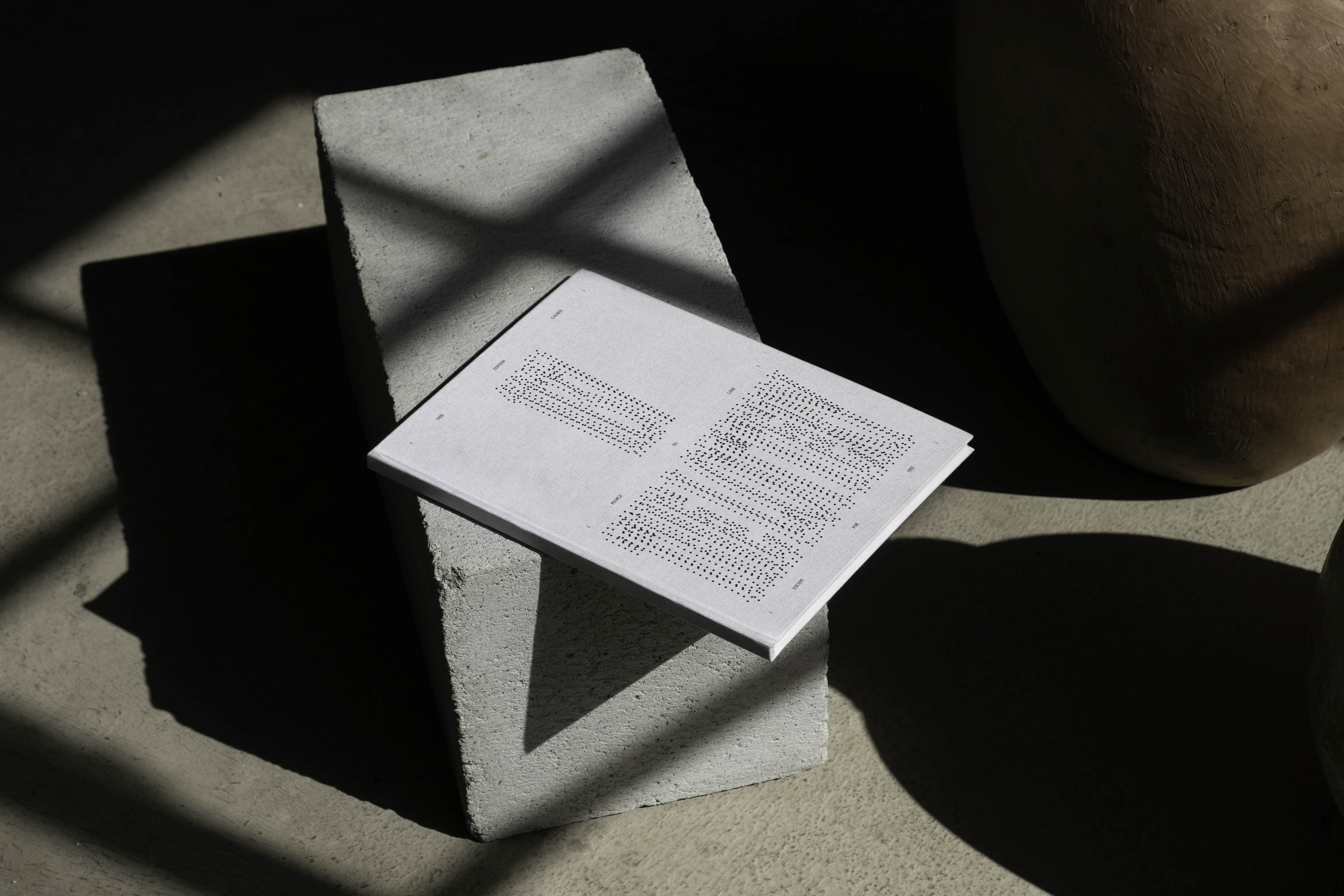
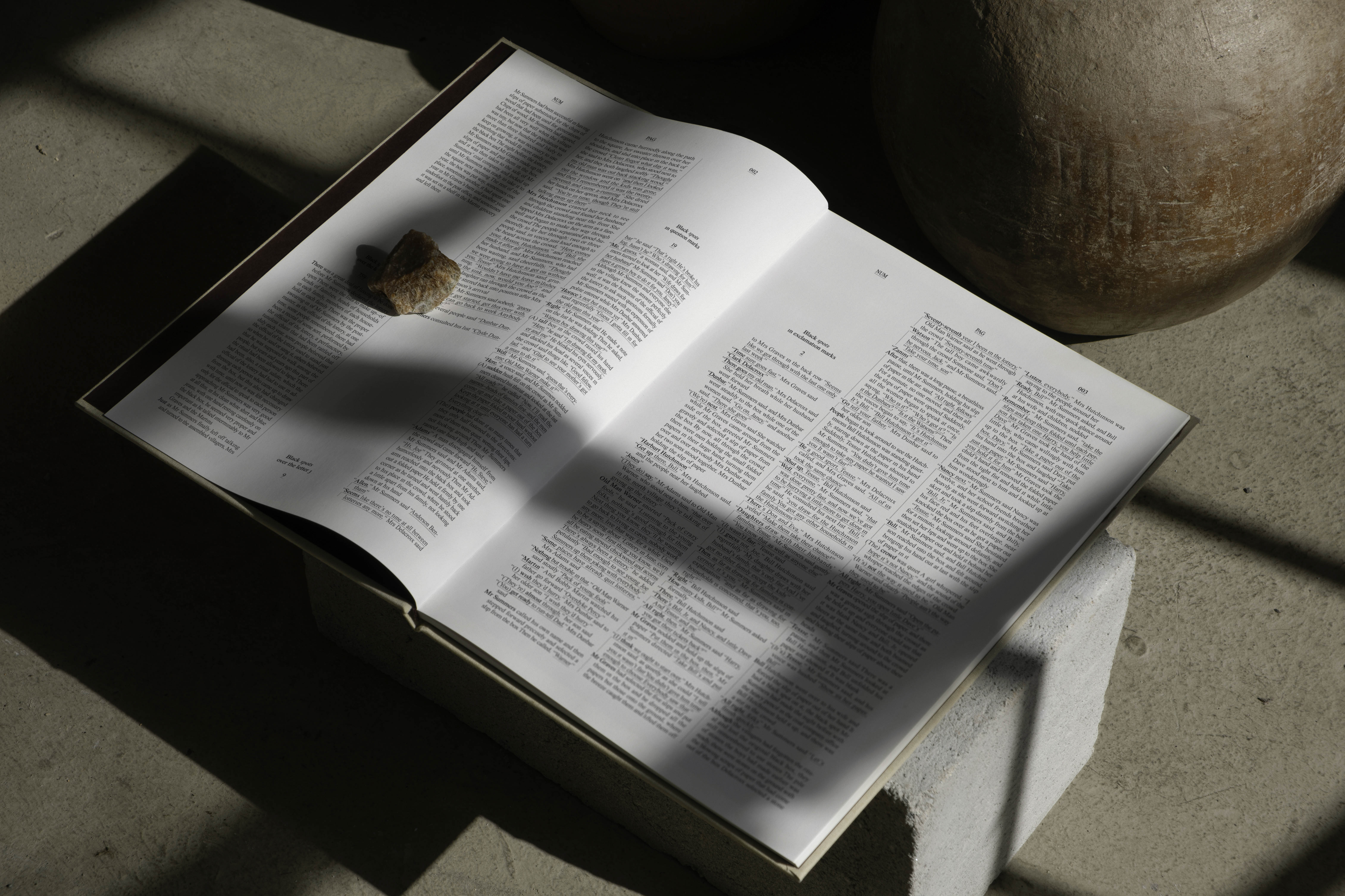
Based on these two concepts, the editorial adopts an aesthetic that mimics the layout of a dictionary – the quintessential book that presents its content in an alphabetically ordered list. It incorporates features such as column dividers, first-line indents, bolded names, and white spaces for images or illustrations. As for the dot, a modification is made to the font used ( Times Now ), removing all the dots present in the glyphs. Throughout the editorial, there will be a count of the dots removed, culminating in a single, definitive dot at the end of the book, mirroring the short story’s conclusion.
On the cover, all the dots that were removed from the text ( 1,137 dots ) are arranged semi-randomly to form the title “The Lottery”.

( References )
➀ Zoë Heller ( 2016 ). The Haunted Mind of Shirley Jackson.
[ online ] The New Yorker.
➀ Zoë Heller ( 2016 ). The Haunted Mind of Shirley Jackson.
[ online ] The New Yorker.